Almost everyone arrives at this search after the same sequence. There was a wall chart, or a spreadsheet with conditional formatting, or a bullet journal spread that took an hour to rule. It looked wonderful. It was maintained for 5 weeks. Then it stopped being updated and became a picture of February that hung there until you took it down.
The failure is not laziness and it is not the medium. It is that the chart was drawing numbers you supplied by hand. A hand-supplied number is a mood reading, and a beautiful chart of mood readings is worse than no chart, because it is persuasive.
A visual goal tracker is worth having when the picture is computed from work that already happened. That narrows the field considerably, and this article is about what survives the cut.
The test: could you lie to it?
Run every proposed visualisation through one question. If you had a bad month, could you make the picture look fine without doing any work?
A progress bar you drag: yes, trivially. A percentage field you type: yes. A status you set from a dropdown: yes, and you will, because setting it to "on track" costs nothing and feels better than the alternative.
A contribution graph built from daily completions: no. A progress bar computed from finished tasks: no. A streak: no. These are the ones worth looking at, and there are not many of them.
The 5 views that earn their place
1. The year-long contribution graph
One square per day for a year, filled when the habit was completed. It is the single most useful visual in goal tracking, and the reason is uncomfortable: it shows gaps. A streak counter tells you about today. A year of squares tells you that you stopped every August, twice, which is the sort of fact you cannot argue with and would never have noticed otherwise.
In EvyOS every habit carries one, alongside its current streak and a strength score derived from consistency and recency rather than from raw count. A habit done 4 times last week scores differently from one done 4 times in March, which is correct — recency is information.
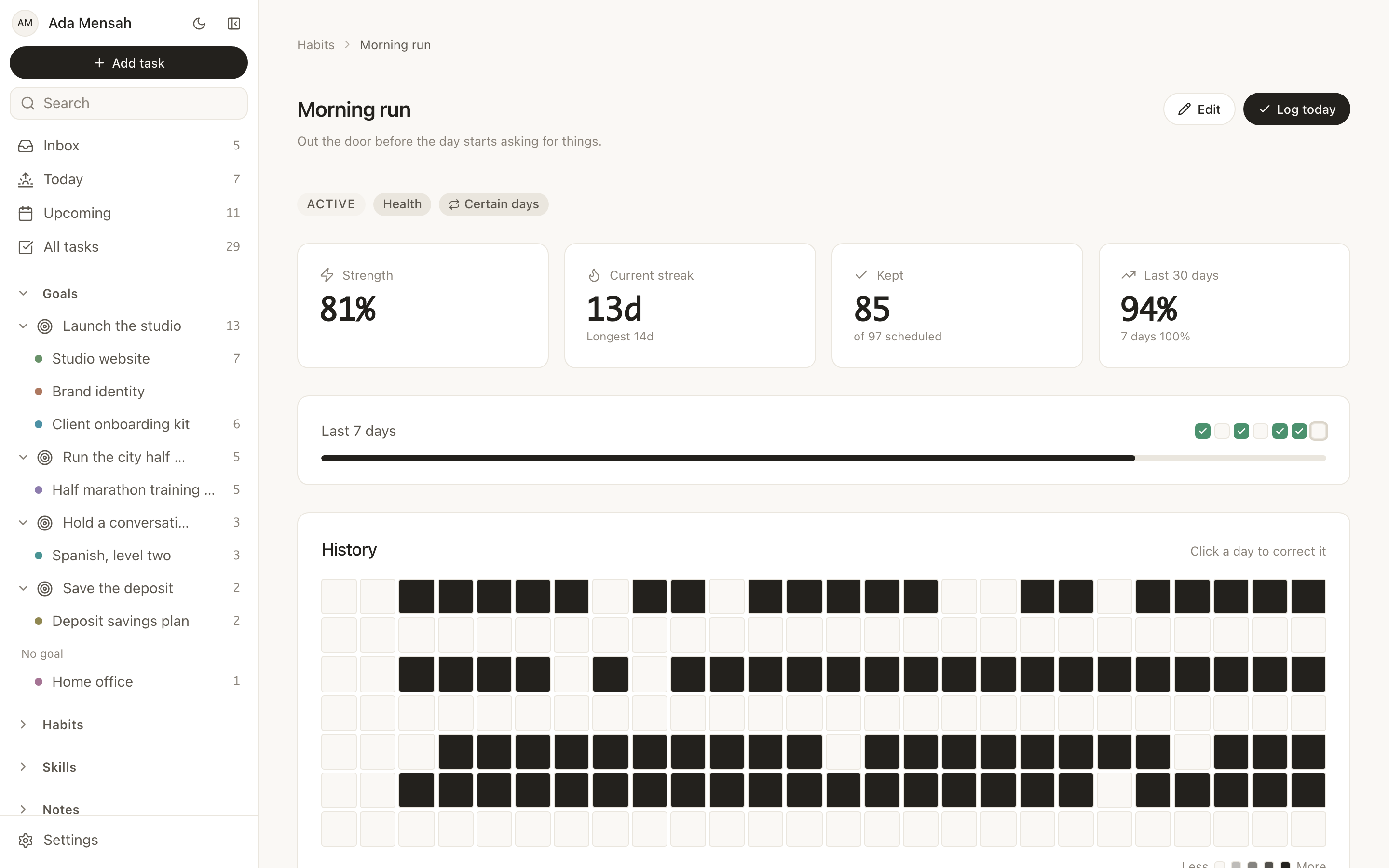
The schedules that feed it are daily or named weekdays, so a habit set for Tuesday, Thursday and Sunday is not marked down for a blank Wednesday. More on how this works on the habits page.
2. Progress bars that you cannot move by hand
A goal in EvyOS has no percentage field. Its progress comes from the projects and tasks underneath it, and the only way to move the bar is to finish something. The same holds for a project against its own tasks and milestones.
This makes the bar boring in the best way. It sits still for 10 days and then moves, which is an accurate depiction of how work goes. A tracker that lets you type the number gives you a smooth, encouraging, entirely fictional line.
3. The goal to project tree
The sidebar shows goals with their projects nested underneath and live counts against each. It is the least glamorous visualisation here and probably the most used, because it is on screen constantly rather than on a dashboard you visit.
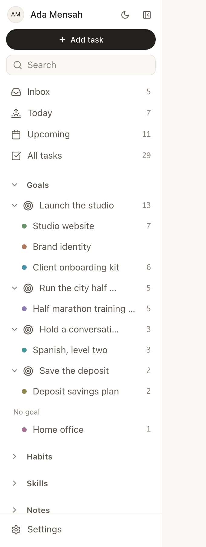
What it answers is structural: which goal has 3 projects and no open tasks, which has 14 open tasks and no end in sight, which one you have not touched. A goal with nothing beneath it is a wish, and a tree makes that visible without any analysis at all.
4. Today and Upcoming, read as pictures
These are lists, but they function as visualisations of load. Today splits overdue work out at the top, then shows what is due, then the day's habits, then the calendar. Upcoming covers the next 7 to 14 days with one section per day.
The useful signal is shape rather than content. A Today view with 4 overdue items and 11 due is not a plan, it is a warning, and you can see that in under a second without reading a word of it.
5. Analytics and progress heatmaps
The analytics dashboard aggregates completion across tasks, habits and skills over time, and there is a weekly summary that arrives whether or not you go looking. Progress heatmaps are on the free plan too.
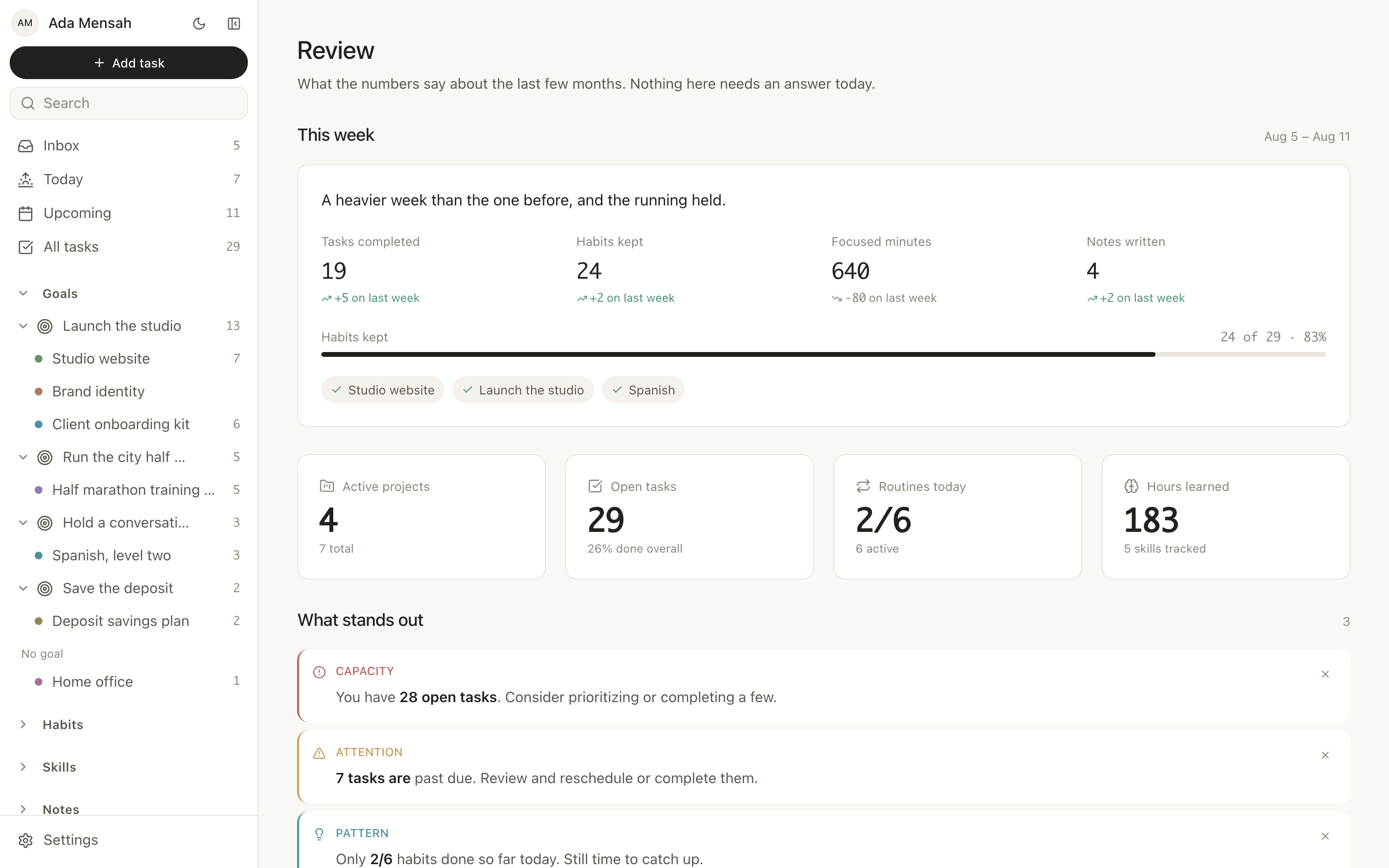
This is the layer worth looking at monthly rather than daily. Checked every morning it becomes another surface to feel bad about.
Which view answers which question
| What you are actually asking | The view that answers it |
|---|---|
| Did I do the thing today? | The habit's streak, in Today |
| Am I consistent, or does it only feel like it? | The year-long contribution graph |
| Is this goal moving at all? | Calculated progress on the goal |
| Which goal is stalled? | The goal to project tree in the sidebar |
| How bad is this week? | Today and Upcoming |
| What has the last quarter looked like? | Analytics and the weekly summary |
If a view does not answer a question you genuinely ask, it is decoration and it will be the first thing you stop maintaining.
What EvyOS deliberately does not draw
Being specific here matters more than being flattering, because "visual" is the word this category oversells hardest.
There is no chart builder. You cannot construct arbitrary charts from your data. There are no custom dashboards — the analytics view is the analytics view. There is no Gantt chart, so if you need to see task dependencies laid across a timeline, this is the wrong tool and a project management application is the right one. There is no Kanban board; work is organised as lists, a goal to project tree, and the Today and Upcoming views.
There is also no Google Calendar or iCal sync, no importer from another app, and no integration other than the ChatGPT and Claude connector. None of that is a visualisation question, but it belongs in the same paragraph as the other things worth knowing before you commit.
If a Gantt chart or a board is the picture you came for, a competitor is your answer and it is not worth pretending otherwise.
If you want something on paper
Screens are not always the right surface. A goal you look at every day often works better printed and stuck somewhere you cannot avoid it.
The yearly goal tracker puts a theme per quarter, the goals under each, and a 12-month grid on one page. The 90-day goal tracker is one goal, 12 weeks and a weekly score, which is the shortest span that can hold something significant and the longest you can keep in your head. The goal tracker is the single-goal version: the measure, the deadline and where it stands. All 3 run in the browser, save as you type, print, and need no account.
Start with one habit and one goal
The fastest route to a visual goal tracker that survives past February is not a better chart. It is one goal with real projects under it and one habit that feeds it, left alone for 6 weeks. At the end of that the contribution graph will have something to say, and the progress bar will have moved or it will not have, and either answer is worth more than a dashboard built on week one.
See how goals are structured on the goals page, what Pro adds on pricing, and start on the free plan — 2 active goals, 5 active projects, 20 open tasks, 5 habits and 5 skill tracks, counting open items only.
Frequently asked questions
What makes a goal tracker visual rather than a list?
Whether the picture is computed. A contribution graph, a calculated progress bar and a live count in a tree are all derived from records you created by doing something. A colour-coded status you set yourself is a list with paint on it.
Does EvyOS have a Gantt chart or a Kanban board?
No, neither. Work is organised as goals with projects nested underneath, task lists, and the Today and Upcoming views. If dependency timelines or board columns are essential to how you think, choose a tool that has them.
Can I build my own charts or dashboards?
No. There is one analytics dashboard and it is not configurable. That is a genuine limitation compared with a database tool where you assemble the views yourself, and the trade is that there is nothing to build or maintain.
Are progress heatmaps free?
Yes. The progress heatmaps, the contribution graph on each habit, the calculated progress bars, the goal tree, the analytics dashboard and the ChatGPT and Claude connector are all available without paying — the details are in free goal tracking app.
How often should I look at any of this?
Streaks and Today, daily. The contribution graph, weekly, at a fixed time. Analytics, monthly. Checking a long-range view every morning converts a measuring instrument into a mood-management device, and the graph starts driving the work rather than recording it.
Which app has the best visual goal tracking?
It depends on which of the 6 questions in the table above you actually ask. Tools built around databases will draw more, at the cost of you building it; habit-first apps do contribution graphs well and hold no goal record. We went through the trade-offs across 5 options in the best goal tracker app.