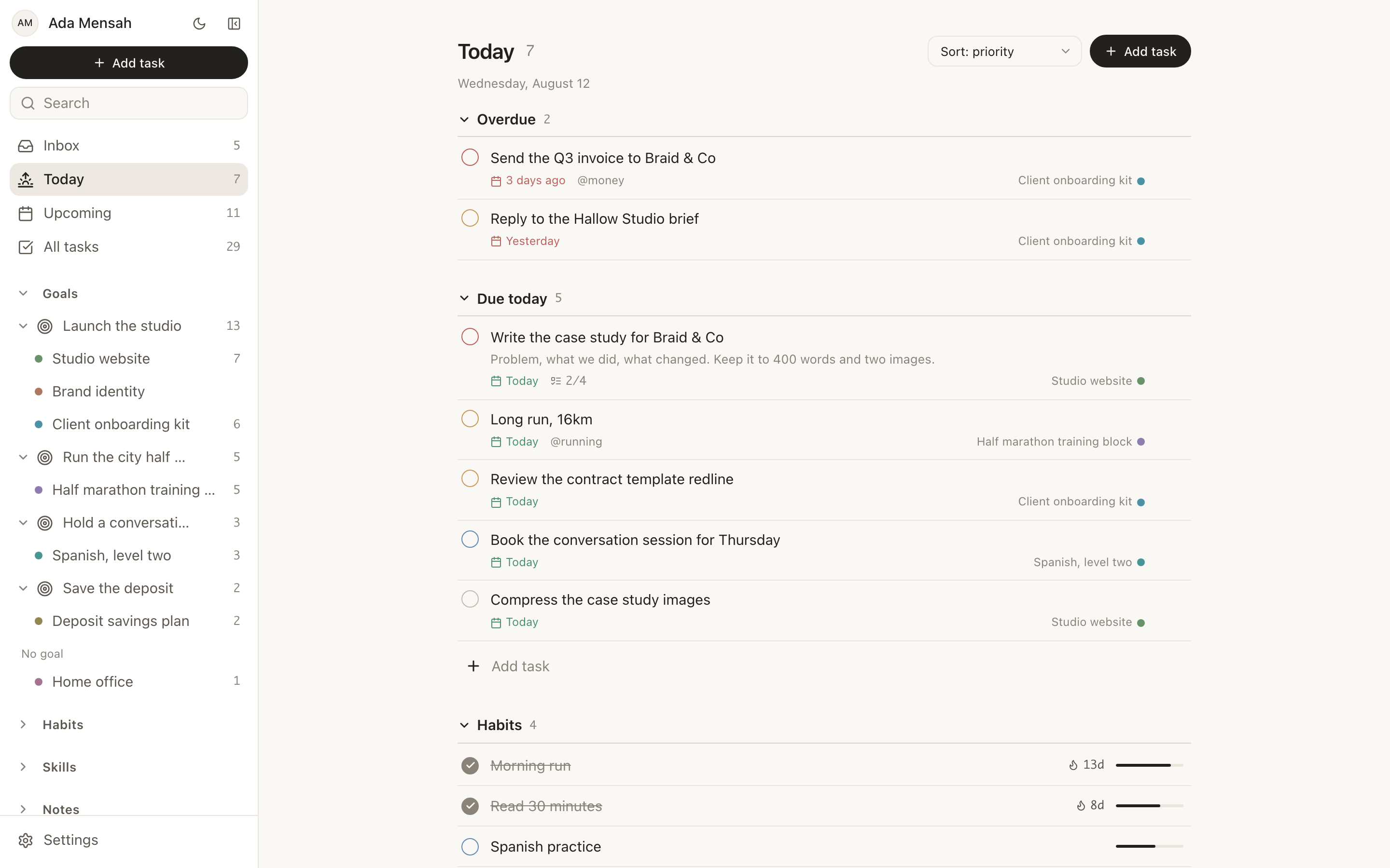
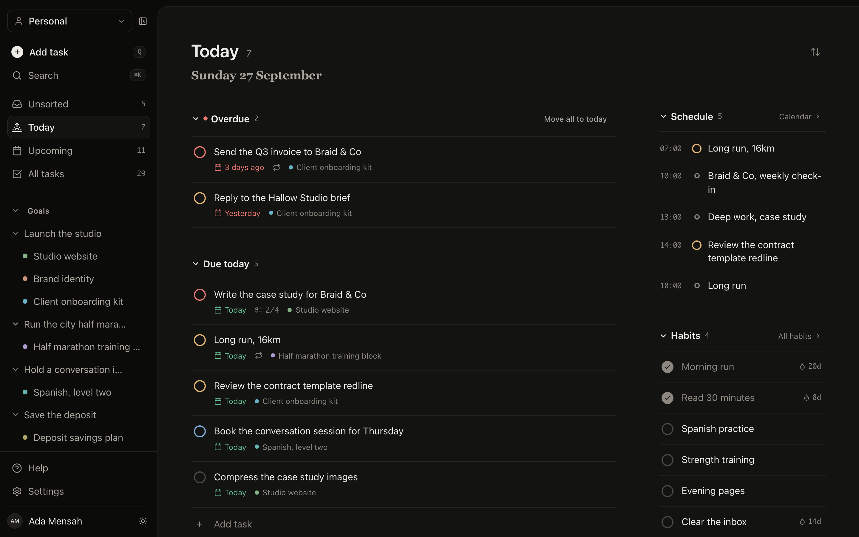
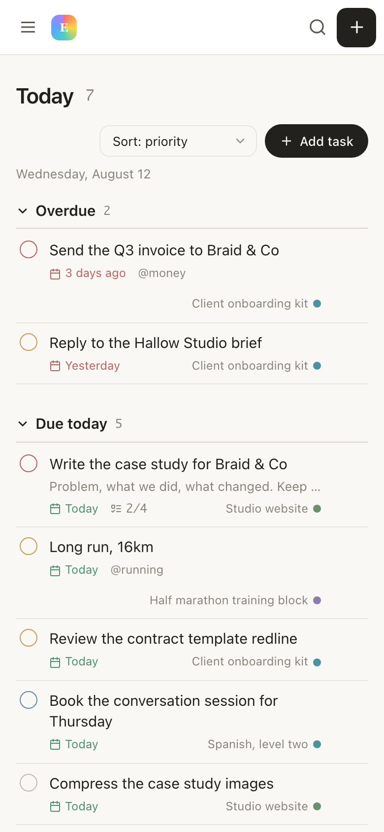
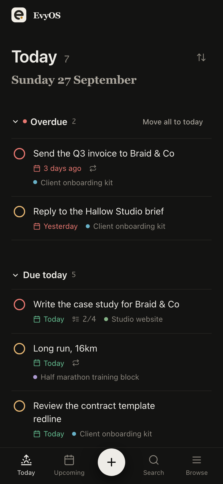
Most to do lists are a flat pile that grows until you stop opening it. In EvyOS a task carries a priority, a due date and a project, and that project sits under a goal, so the thing you tick at 4pm is visibly part of something you decided to do.
Free for 20 open tasks. No card, no trial countdown.
A task is the unit of doing, so it has to carry the details that decide whether it gets done. It does not have to carry 30 of them.
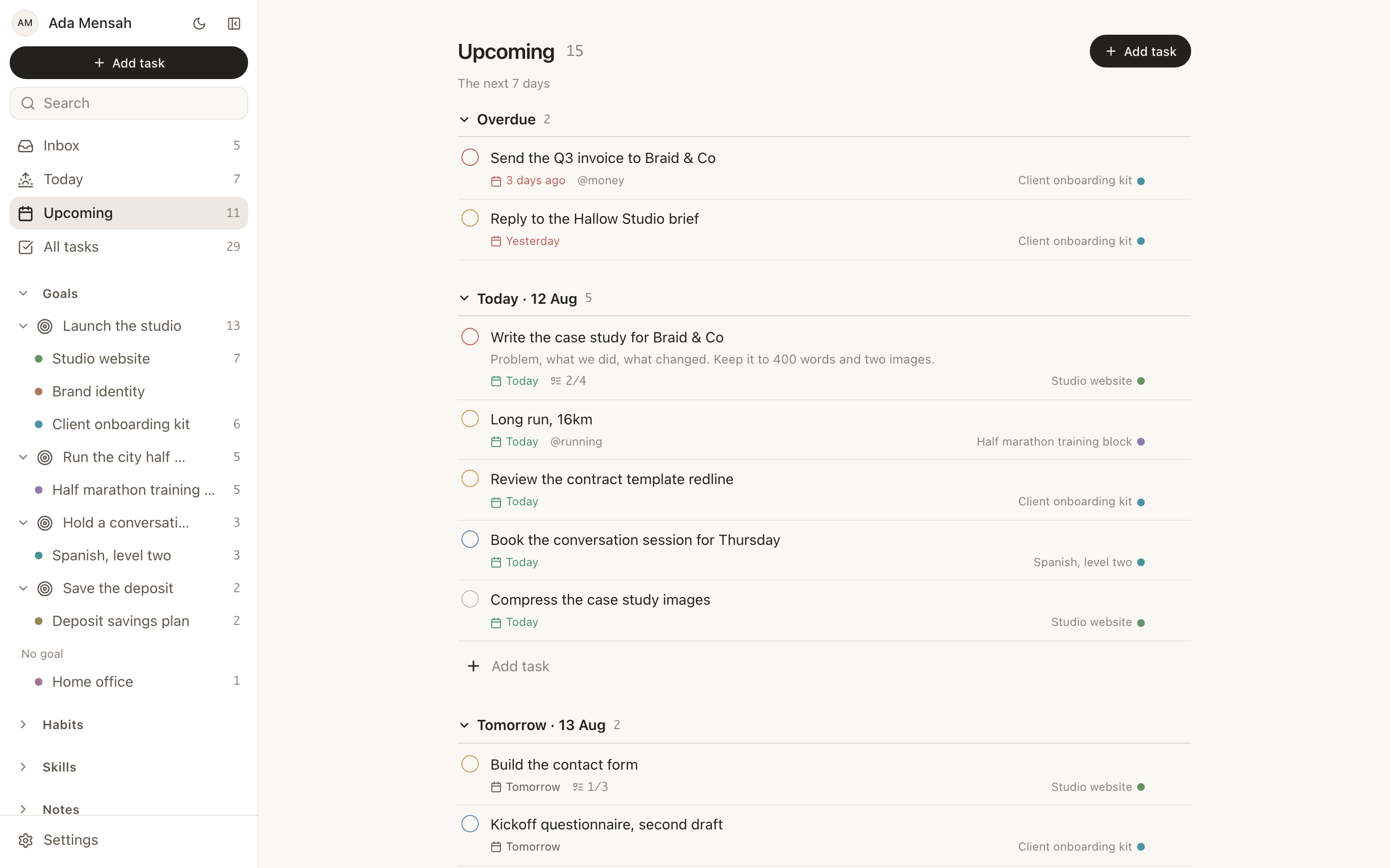
P1 to P4, drawn as a coloured ring on the checkbox. You read the shape of the list without reading the list, and four levels is few enough that ranking never becomes the work.
A due date appears as a chip on the row, coloured when it is today and coloured differently when it has slipped. Overdue work is never quietly mixed in with the rest of the day.
A checklist inside the task, for the 6 small steps that only make sense together. The list stays one line until you open it, which is the point of having subtasks at all.
Repeat on a schedule and enter it once. The next instance arrives on its date rather than sitting in the list all year looking undone.
Say how long you think it will take, then record how long it did. Over a few weeks the gap between the two is the most useful thing you know about your own planning.
Tags for the cuts a project cannot make, comments for the context you will have forgotten by Thursday, and files kept with the task instead of in a folder somewhere.
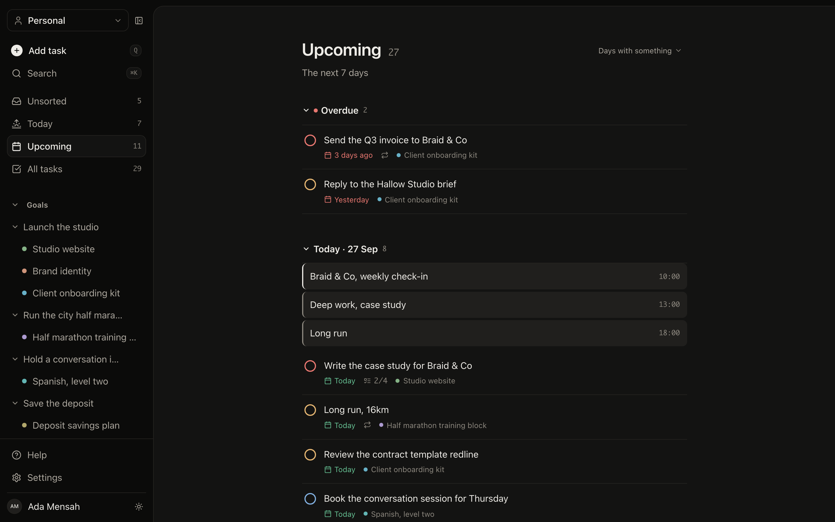
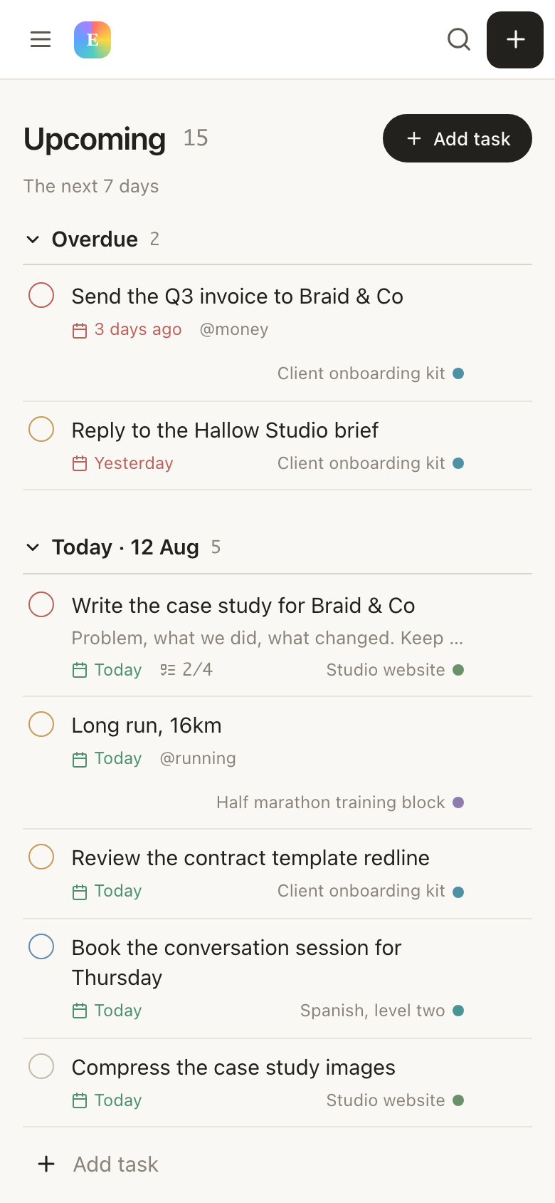
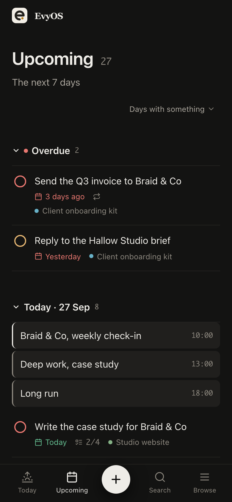
Today puts overdue work in its own section at the top, before anything else. Most apps blend what slipped into what is due, and the result is a list you distrust by Wednesday. Below the split sit the tasks due today, the habits scheduled for the day and whatever is on the calendar, so one screen answers the question you actually opened the app to ask.
Upcoming lays out the next 7 to 14 days as one section per day, so a heavy Thursday is visible on Monday while you can still do something about it. It is the view for deciding, rather than the view for working: move a due date, and the shape of the week changes with it.
The all-tasks view holds the full list with filters and sorting, for the weekly review and for the moment you know a task exists but not where you put it. A command palette searches across records if you would rather type the name than find the filter.
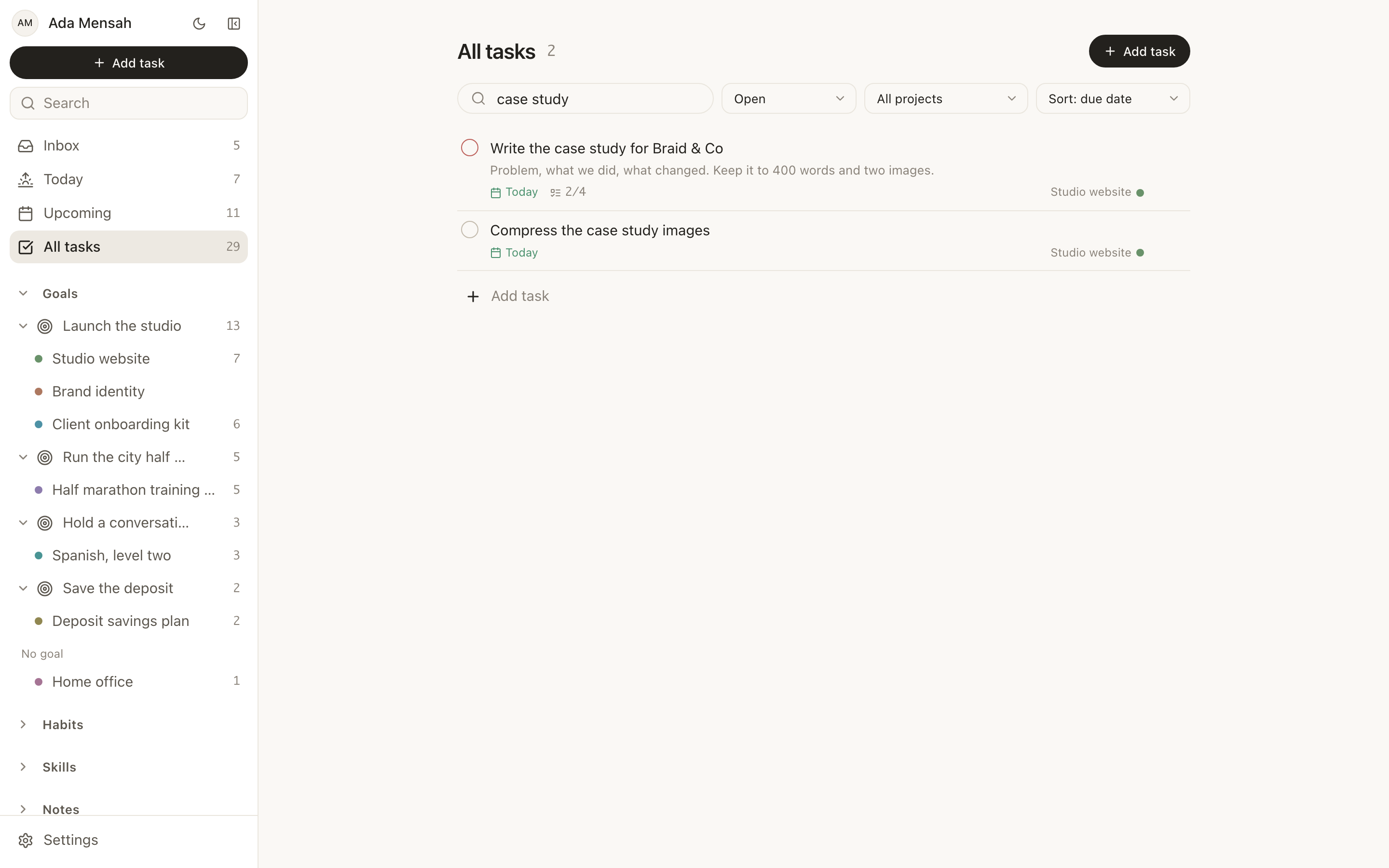
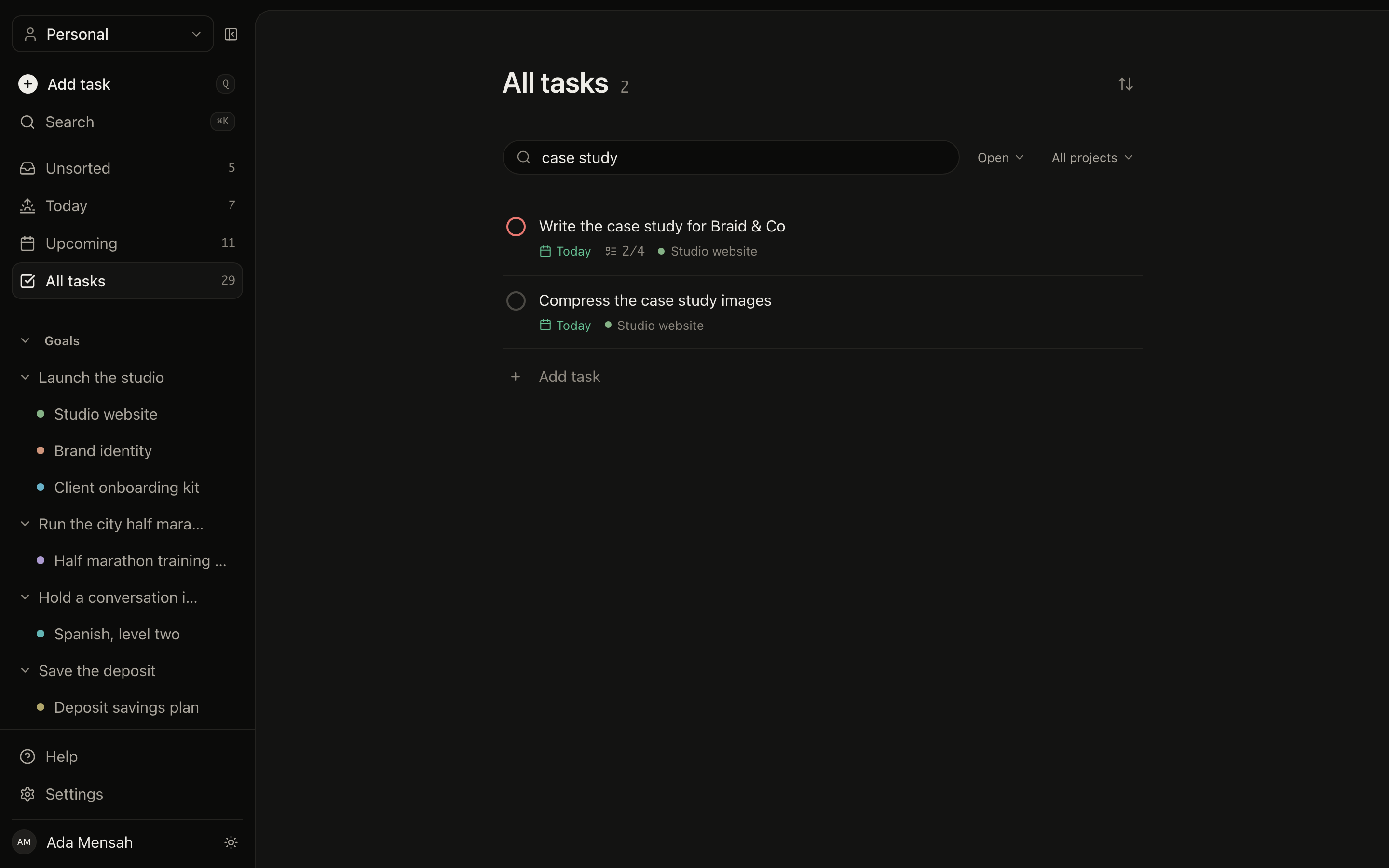
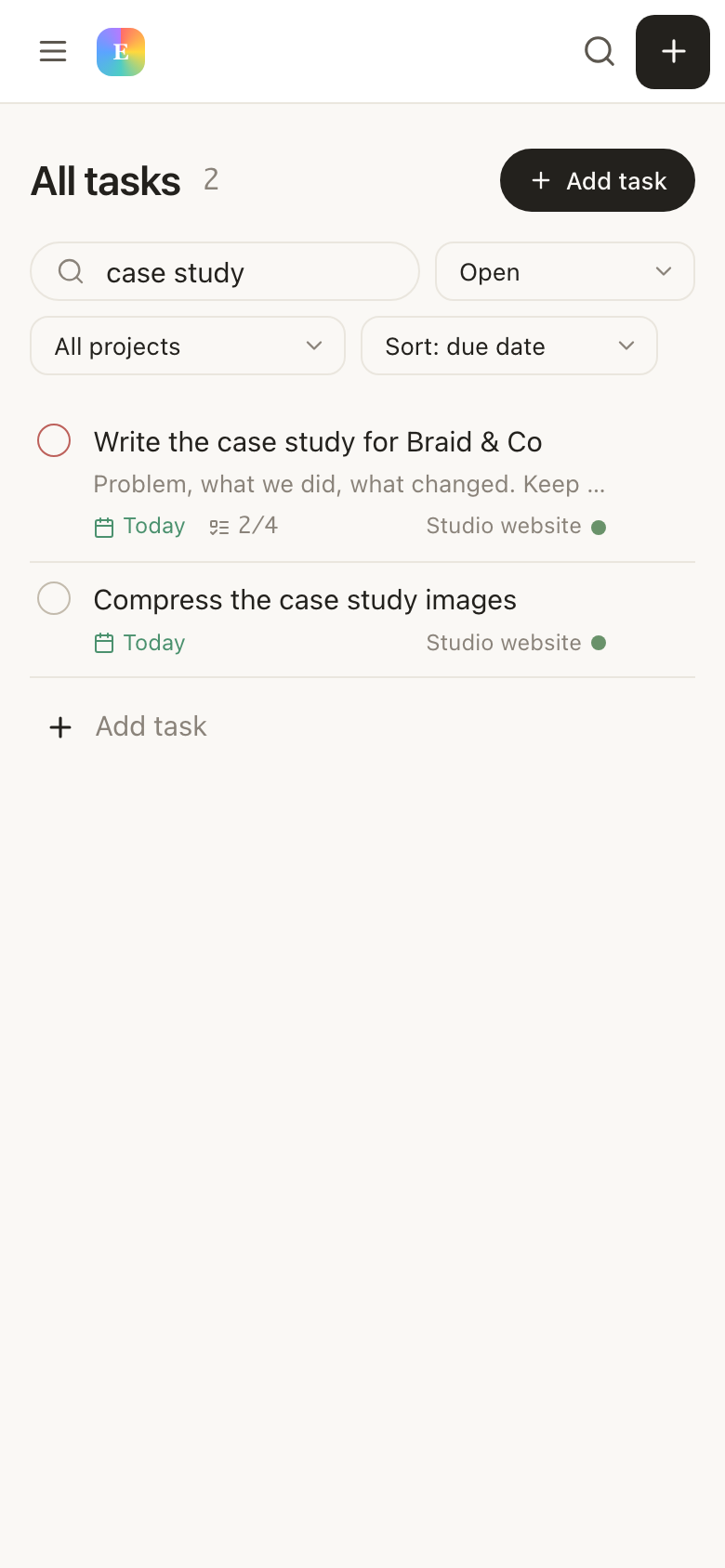
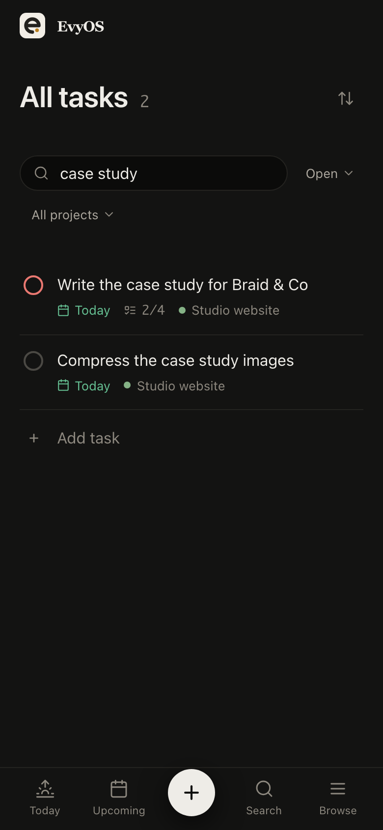
Task detail opens as a panel that slides in over the list rather than a page that replaces it, so working through a batch never costs you your scroll position. Add a subtask, leave a comment, change the due date, close it, carry on down the list. Every task also has its own URL for the times you want to link to one.
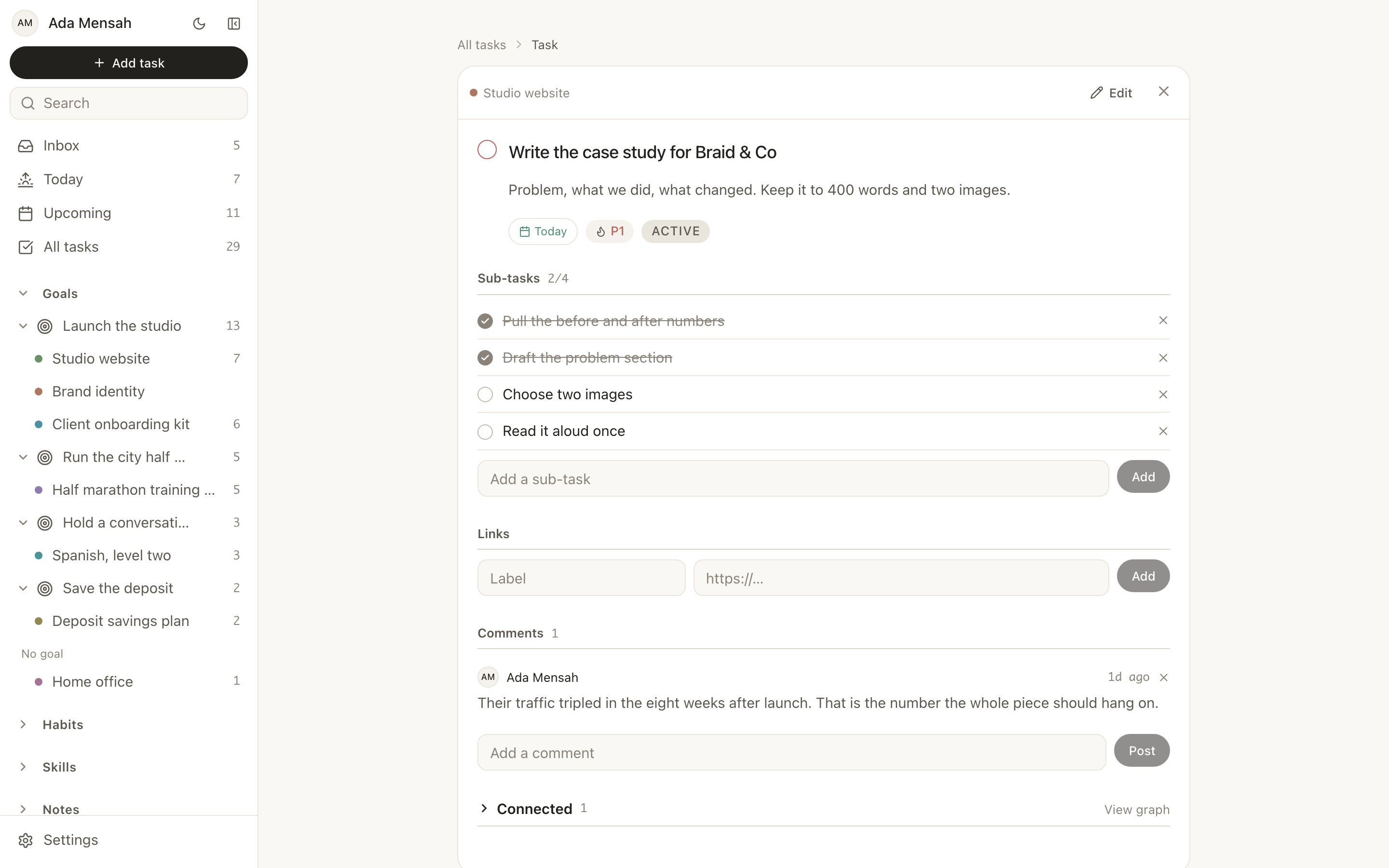
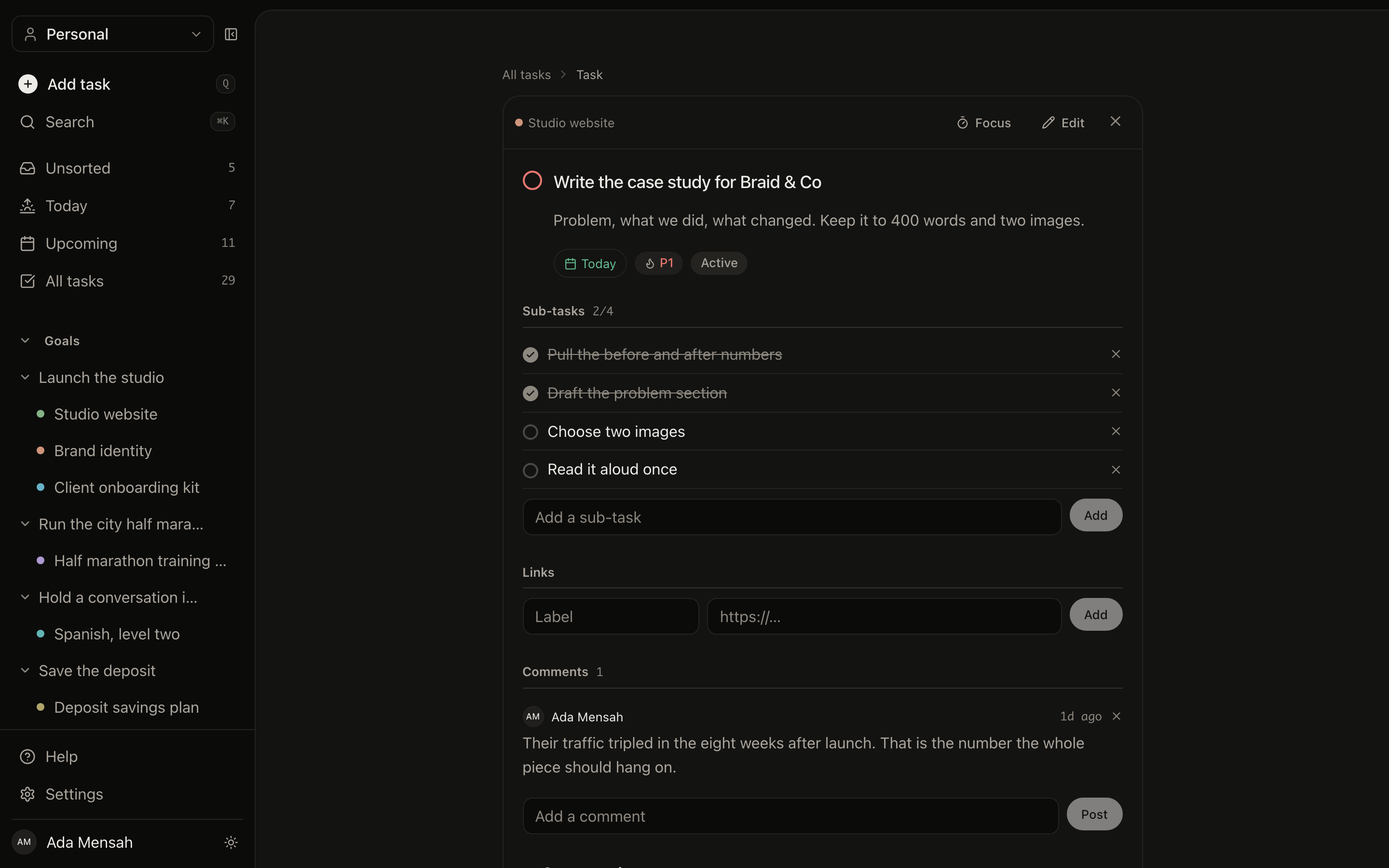
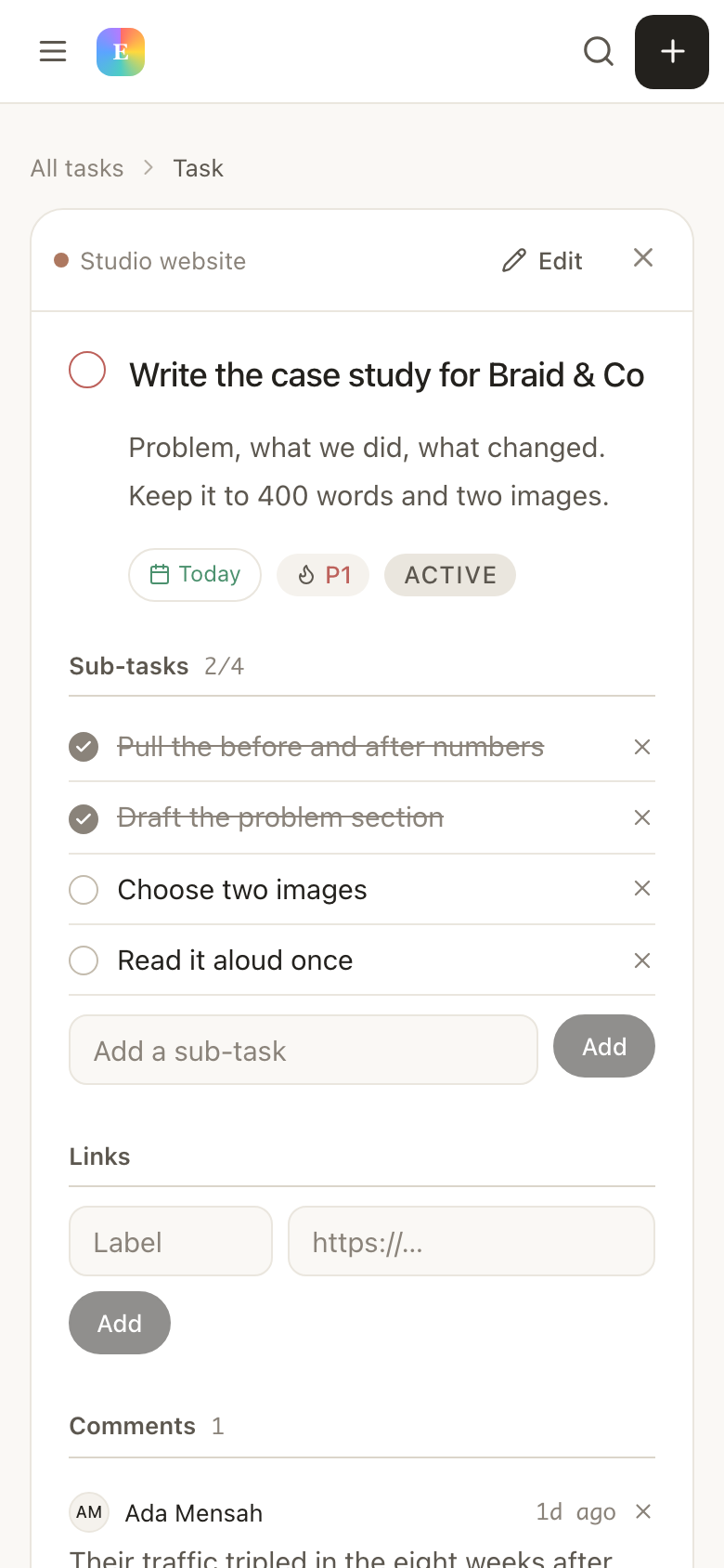
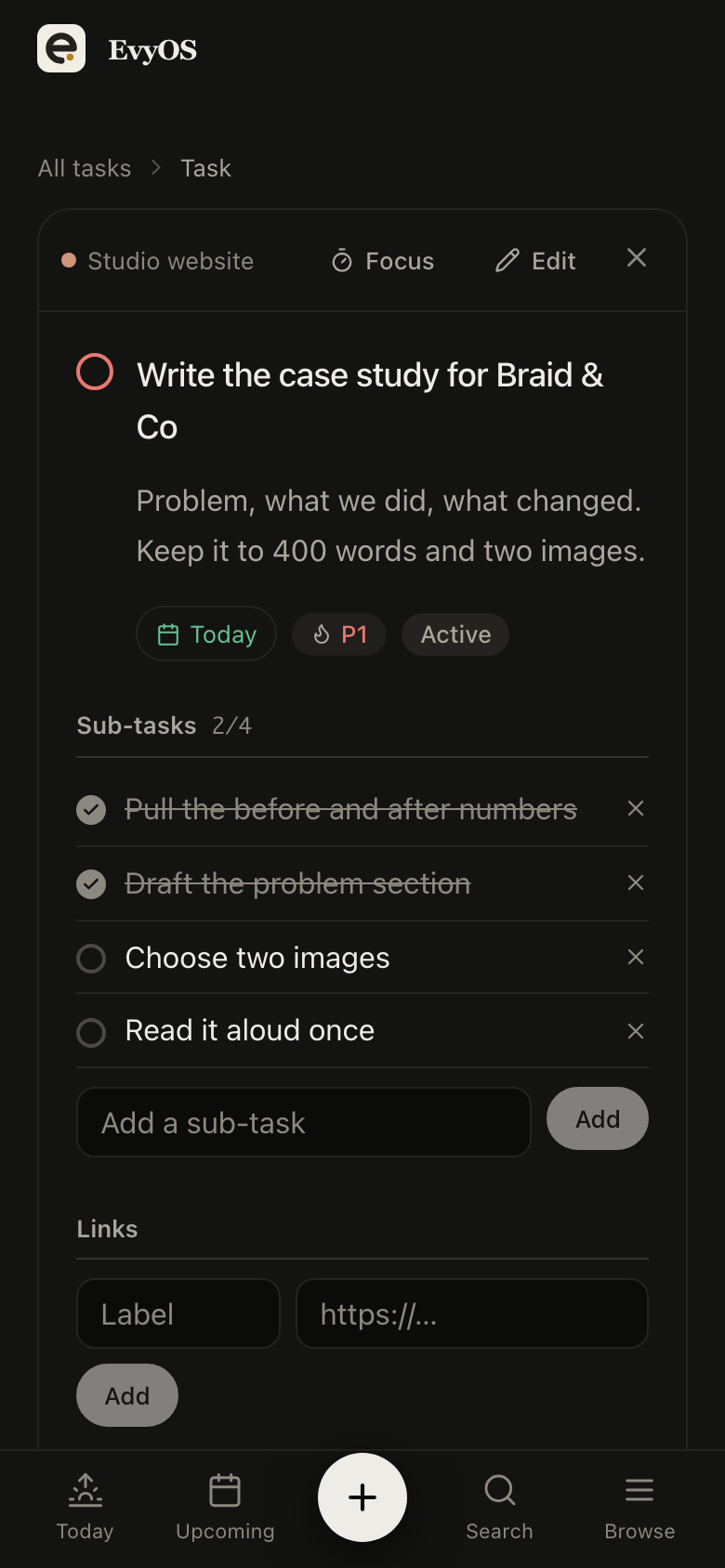
The reason lists rot is that nothing above them ever changes when you tick something. Here a task sits in a project, the project sits under a goal, and finishing the task moves both.
The outcome you are after this year, with its own milestones. Its progress is calculated from the work underneath it rather than from a slider you drag when you feel optimistic.
The piece of work that gets you part of the way. A project has a colour and a dot, so its tasks are identifiable at a glance wherever they turn up.
The thing you actually do on Tuesday. Tasks with no project yet wait in the unsorted inbox, which is where fast capture is supposed to land.
Use the inline composer and type without stopping to categorise. Anything with no project waits in the unsorted inbox, which is what it is for.
Make the 3 or 4 projects those tasks were really about, move the tasks into them, and put a priority and a due date on the handful that have one.
Open Today, clear the overdue section first, then work down. Check Upcoming once a week to see which day is about to be a problem.
The free plan counts open items only, so finishing something gives the slot back and your completed work never counts against a limit. Plenty of people never need more than that.
See the plans →Put your tasks under the projects and goals they were always for, and open one screen in the morning instead of four.
Start for free →